Font Choice: Why Typography Matters for Your Brand
As you work to establish your brand’s identity and exhibit a professional digital presence, it’s common to focus on using clear word choice and developing a tone that effectively appeals to target audiences. It’s certainly fundamental to present website visitors with relevant information about products and services in a way that best fits your business’s voice. However, what you might not have considered is the intentional selection of typography for the words you use.
Choosing the right web fonts to fit your business is vital in establishing your brand identity. According to MDG Advertising, 72 percent of consumers say that design has an influence on their purchase choices, and 75 percent of consumers say that they judge a business by its website design. As you’re building your brand, it’s important to think about these perceptions as you develop all aspects of your marketing and design, and this includes font choice and style.
To help, we’ve highlighted some key components to consider when searching for the right fonts.
Readability, accessibility, and credibility are the three most essential aspects of typography in branding and website presentation for your business.
Readability
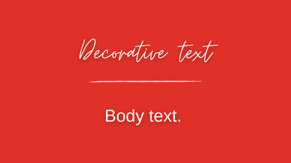
Always use fonts that are easy to read. Using the appropriate font for your header is just as critical as choosing a font that best fits the body of your text. For instance, an unusual or script font might be useful for a logo or header, but it is difficult to read in the body of a text because of its ornate nature and style. Therefore, avoid them in most cases. There are various fonts that are designed for optimal readability on web pages, and you can find a list of these here.

Consider typographical emphasis (such as bold, italic and underlines) for specific phrases, sections or keywords to attract more attention. But use them sparingly. It’s also necessary to ensure that they are large enough and the letter spacing does not make it more difficult to read.
Accessibility
Readability and accessibility go hand-in-hand. Audiences who are visually impaired should always be considered when you are reviewing your font choices. Screen readers are devices and programs that capture text-to-speech through images, and using fonts that can be easily captured and translated by this technology is effective and important.

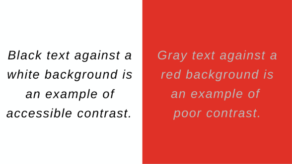
It is difficult to read text that blends into the background color of a webpage. Choose fonts that have high contrast against the background of your webpage. This will improve accessibility and readability for all audiences. More on font accessibility can be found here.
Credibility
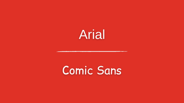
Ensure that your chosen typeface matches the character and atmosphere of your business’s website. Sans serif fonts are generally acceptable for body text, but it’s important to use the right sans serif font for your business. Arial, Tahoma, and Verdana are widely used sans serif typefaces that are safe web fonts because they are readable, accessible, and have a professional appearance. In contrast, comic sans is a readable font for body text, but it has more playful and informal connotations that might impact your website’s credibility.

Intentionally selecting fonts that represent your brand’s identity is key when it comes to credibility and establishing a consistent voice as you seek to attract clients.
Choosing the right fonts will not only improve the aesthetic value of your website, it will improve the overall user experience and make it more inviting to explore the rest of the site. It will also aid in establishing your digital presence as a professional organization that exhibits attention to detail, whether it’s a digital presentation or the quality of your products and services.
Fiore Communications is a full-service marketing firm, and we’re here to help your business develop a credible, consistent brand identity and a polished digital presence. Call 850.668.0510 or click here to contact our team.


