Creating and Using CSS Sprites to Improve Google PageSpeed Scores
Fiore Communications recently rolled out our new website which, let’s face it, is a lot easier on the eyes than Ol’ Faithful was. To make sure our new site was not only pretty, but fast, functional and optimized, we used a variety of online tools. One of my favorites is GTmetrix, which combines Google PageSpeed and YSlow results, while also reporting on page loading time, page size and HTTP requests.
With a few minor tweaks and a stellar caching plugin, we were well on our way to scoring green across the board. One specific Google PageSpeed recommendation, however, continued to haunt me with a big orange grade D: Combine images using CSS sprites. PageSpeed did not that we were using four social media icons in two separate locations on our homepage.

What the heck is a CSS sprite?
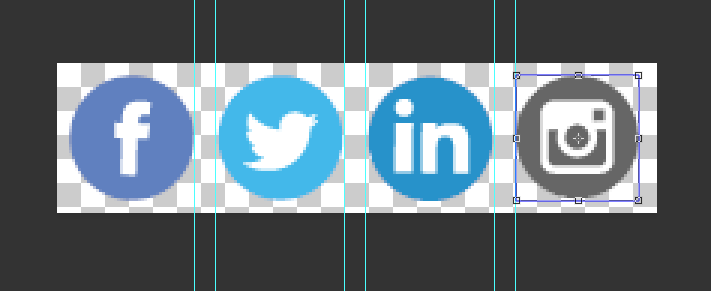
Simply put, a CSS sprite is a combination of images into one image. Developers use CSS to tell the browser which part of the image to display where on the webpage. In our case, PageSpeed recommended combining our Facebook, Twitter, LinkedIn and Instagram icons into one image.

What can they do for website optimization?
Combining multiple images into one reduces the number of images that the browser has to download. The fewer images and resources that need to be downloaded, the fewer delays and the faster the load time! Developers, designers, bosses and digital marketers may disagree on content, color and calls-to-action, but no one can argue with a faster website.
How do you create CSS sprites?
You will need access to the images you want to combine and either some type of image editing software or a sprite generator. I like to use Adobe Photoshop.
Open all of your separate images in your editing software or upload them to your sprite generator. Place them all on the same canvas and save as one image.
I chose to resize the canvas of my Facebook icon to 400 percent wide, making sure to add an anchor to the left side of the canvas, and added the other icons in a row. In Photoshop, I used the rectangular marquee tool to paste the icons onto the newly expanded Facebook canvas, making sure that the space between them was equal.
For me, creating and using CSS sprites is a lot easier when the individual images have the same dimensions. Our social icons were 50p- by-50px PNGs.

Please note that you don’t necessarily need more than 1 pixel of whitespace between images. Placing the images as close together as you can will help keep the image size down, especially for sprites made with large images. Keeping our social icons at 50px wide meant I didn’t have to take an extra step and crop each one or worry about the math when it came to writing my CSS rules.
I saved the image as a new PNG, uploaded it to our website and my CSS sprite was done!
How do I use them?
Once you have your CSS sprite, you need to apply it as a background image to the correct element on your website. Then you choose what part of the image is displayed, depending on the situation, using the background-position property.
You will need to know the dimensions of the relevant pieces of your sprite. If you have a row of images, you will just need to know the width of each piece in pixels. For sprites set in a column, you will need to know the height. It helps to have the sprite open in your editing software or program so you can find the exact x and y locations. If not, you can always make your best guess and then tweak as necessary. My icons were all 50px by 50px in a row, meaning I could set the background position Y to center for each and the background position X in negative intervals of 50.
Armed with your pixel dimensions, you will need to find the relevant code on your website and change it. We have the social icons in two places: in our footer and in the body of the homepage. For WordPress, this meant editing our homepage and the footer widget the social icons live in. The icons were displayed in the same order in both places, which made the process that much easier.
Originally, the HTML in each location included four images and four links, one for each social media profile, wrapped in a paragraph tag.
Original:
<p>
<a href="https://www.facebook.com/fiorecommunications" target="blank"><img src="/facebookicon.png"></a>
<a href="https://twitter.com/fiorecomm" target="blank">"><img src="/twitter.png"></a>
<a href="https://www.linkedin.com/in/davefiore" target="blank">"><img src="/linkedinicon.png"></a>
<a href="https://www.instagram.com/fiorecommunications/" target="blank">"><img src="/instagramicon.png"></a></p>
Updated:
<ul class="social_icons">
 	<li id="fb_icon"><a href="https://www.facebook.com/fiorecommunications" target="blank">Facebook</a></li>
 	<li id="twitter_icon"><a href="https://twitter.com/fiorecomm" target="blank">Twitter</a></li>
 	<li id="linkedin_icon"><a href="https://www.linkedin.com/in/davefiore" target="blank">LinkedIn</a></li>
 	<li id="instagram_icon"><a href="https://www.instagram.com/fiorecommunications/" target="blank">Instagram</a></li>
</ul>
To update the code, I removed the image tags and replaced them with an unordered list. I gave the list a class and each list item an ID so I could target them with my CSS rules. Whether or not you will need to alter your HTML will depend on how it is already structured and whether or not you need to link the element(s). For example, if you were already using the background-image property for two div tags, and you created a CSS sprite to combine those two images, you can leave your HTML as is and just adjust your CSS.
Then I wrote my CSS. I targeted each list item in turn, setting a background image and the background position using the background property.
.social_icons li {
background-image: url('/wp-content/uploads/2018/05/social_icons_opt.png');
background-position-y:50%;
display: inline-block;
height: 50px;width: 50px;
margin-left:0px;}
.social_icons li a {
color: rgba(0, 0, 0, 0.0);
width:50px;
height:50px;
text-indent: -10000px;
display: block;}
.social_icons #fb_icon {
background-position-x: 0px;}
.social_icons #twitter_icon {
background-position-x: -50px;}
.social_icons #linkedin_icon {
background-position-x: -100px;}
.social_icons #instagram_icon {
background-position-x: -150px;}
.social_icons {
list-style-type: none;
margin-left:25%;}
First, I set the CSS sprite as the background image for my list items and set the background position Y to 50 percent. Doing it this way, as opposed to setting the CSS sprite as the background image for <ul>, allows the icons to still appear to be separate images and appear on multiple lines as the browser resizes.

Next, I set the background position X property for each list item. This is the step that requires a little math. Because my icons were all 50px wide and appeared in the same order in the sprite as on the page, I just adjusted by -50px for each subsequent icon. All that was left was to make sure my list didn’t have any list-style-type and had the margin I wanted.
How do I use links with CSS sprites?
In most cases, defining background images and positions will be enough when using CSS sprites, but sometimes you’ll want to link your elements to different URLs. In our case, we still needed to link to our four different social media profiles.
First I tried using a non-breaking space in each list item, but the CMS kept removing them and the link tags didn’t respect my width and height declarations when they didn’t have any content. My next step was adding text for each icon. I made the text transparent, but you could still see it when you highlighted the icons.

I solved this issue by using text-indent to effectively move the text out of the browser window. Please note that you also need to set the display property for your links to block for this to work.
Our CSS sprite was complete and working beautifully.
Our page load time and performance scores improved (PageSpeed by 5 percentage points and YSlow by 2), and we decreased our total page size and HTTP requests.

There is no special sauce for page speed and optimization that works for every website, but CSS sprites can help you reduce requests and make your website faster and more efficient.
Questions about the code or making your own CSS sprites? Leave me a comment; I’m here to help!


