
A logo, the symbolic representation of a brand, typically serves as the initial point of contact for potential customers. Its significance lies not only in making a good first impression but also in communicating a sense of trust and reliability.
Whether you’re looking to create a new logo, refresh your current one, or want to learn the terminology to better brief your designers, we’re here to help.
So, what makes a good logo? Here’s what you need to know about a logo’s significance and some key elements to consider when crafting one.
What Is the Main Goal of a Logo?
It Looks Professional on the Surface…
Typically, the simpler your logo, the better. You want your audience to understand exactly what you do from their first glance at the logo. If there are too many detailed elements or inconsistent messaging, it’ll create confusion and reduce engagement. Additionally, for logistical purposes, a simpler logo can be added to merchandise more easily.
.…But Signifies Something Deeper.
A well-designed logo builds trust and demonstrates your expertise. It tells potential clients who you are, what you do and how that benefits them. It communicates to people with no prior knowledge or experience with your business that you do great work.
Descriptive vs Nondescriptive
A descriptive logo includes textual or visual elements that directly reflect what the brand does. For example, the Instagram logo being a camera reinforces the photo-sharing aspect of the platform.
A nondescriptive logo, on the other hand, contains design elements that are not indicative of the product/service a brand sells. Most large brands use a nondescript logo since they have such wide brand recognition.
A recent Harvard study found that about 60% of companies used a nondescriptive logo, while 40% used a descriptive logo. However, they found the effectiveness of descriptive logos for well-known brands was much smaller than that of unfamiliar brands. Thus, when customers have interacted and become familiar with a brand, they are less likely to be influenced by the logo. Similarly, descriptive logos were less effective for brands that handle serious or uncomfortable topics. Weighing those options is important before crafting the logo. Essentially, when choosing between the two logo types, it is important to note that the benefits of either are not absolute for every brand.
What Makes a Good Logo?
To put it simply: Typography, simple colors and strong visual elements are the core components of what makes a good logo.
Typography
Typography, the style and appearance of text, is important in communicating two things: the tone and personality of a brand.
The brand tone is the attitude with which you convey your values and beliefs, while the brand personality is your brand’s traits and characteristics. Both of these factors work together to reinforce your messaging and the language you use. While there are many factors to typography, three of the most important to consider are fonts, arrangement and hierarchy.
- A font is the unique appearance of text on digital or print medium. There are many great websites such as Adobe Font with many font categories to choose from, making the process of selecting an appropriate font much simpler.
- Arrangement helps unify text and make the work feel balanced.
- Hierarchy helps create visual interest by emphasizing and placing text in the order of importance. Color, weight and size of the font help demonstrate hierarchy.
Reminder: in all artistic choices, form must follow function- you should prioritize the text being legible over the design.
Want to learn more about typography? Read our article Font Choice: Why Typography Matters for Your Brand
Brand Example: Tide
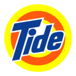
Tide is the oldest and most successful detergent currently on the market. To reflect this, they continue to use the same typeface from 75 years ago as a reminder that they’ve always been around.
The font is bold and eye-catching, and the dynamic slant helps create visual interest. The outline of the text and the bright blue color make it stand out from the orange and yellow bullseye and establish it as the most important feature in the hierarchy.
Simple Colors
Colors are significant in that they can trigger emotions. However, based on culture, trends and context, these typical color associations can change from the desired impact. Brands usually stick with three or four primary colors and opt to have other options as their secondary or tertiary colors. Here are some typical color associations you’ll want to consider when crafting your logo.

Brand Example: Indeed
Indeed has their three primary colors- blue, white and black. The color blue can represent serenity, stability or wisdom. They’re posing themselves as a reliable and trustworthy company through their color choice alone.
However, they have secondary and tertiary colors used in different campaigns.
Strong Visual Elements
Two factors are important to consider to really help your logo pop:
- Negative space. Optimizing negative space- the empty space around and between the subject(s) of an image- ensures a clean and balanced design, making it easy for viewers to understand what it is you do.
- Using text as part of the design. This is a creative way to communicate the brand’s purpose through text warping and/or placement.
Overall, the goal is to keep the design simple yet compelling, and foster a clear understanding of what the organization does. Over time, this will establish a strong and memorable association for the brand.
Below are examples of logos that optimize white space, are simple to understand and reflect the brand.

Brand Overview: Pringles
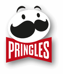
Pringles has all the elements of what makes a good logo. The pringles text fits into the character’s bowtie, cleverly utilizing white space. The use of bold, warped, uppercase text exudes a vibrant personality, while the limited color palette maintains simplicity.
Over the years they built up brand recognition with their little character, Julius Pringles, eventually breaking him down to his simplest, most recognizable form. Pringles are crisps but their brand is silly, bright, playful and innovative, a sentiment seamlessly reflected in their distinctive logo.
Time To Redesign Your Logo?
Choosing all the proper elements of a good logo will ensure easier brand recognizability, communicate your brand’s purpose and build positive associations with your brand. Creating a logo under these guidelines, while incredibly important, can be a very time-consuming and detailed process. At Fiore Communications, our team specializes in creating and managing your brand products—including logos. Contact Fiore Communications today to get started.
About the Author

Eve Larkin
Fiore Communications Content Marketing Intern, Spring 2024
An award-winning graphic designer and creative director, Eve Larkin graduated with her B.S. in advertising and is working towards her master’s in public interest media & communication at Florida State University. Eve is now a Junior Account Manager at Sach’s Media, and excited for wherever the future takes her next!